
Basics of Color Theory in Game Design
Color theory is the basis for creating bright and memorable game illustrations. The important aspects are the primary colors – red, blue and yellow – which serve as the basis for the formation of all other shades. When working with colors, it is important to consider their contexts, such as warmth or coolness, brightness and saturation. The use of contrasting colors can create a dramatic effect, while harmonious color transitions enhance the calm atmosphere of the game. All these components must be used consciously to avoid overload or confusion in perception.
The color scheme in a game can affect the player’s emotional perception, creating a certain atmosphere. For example, fantasy games often use green and gold to convey a magical atmosphere, while horror games tend to use dark, cold colors to evoke feelings of fear and tension. Knowing and using these principles allows you to create deeper and more expressive visual images that not only support the atmosphere, but also enhance the gameplay.
Psychology of color and its influence on perception
Color affects the player’s perception of the game world, his emotions and even behavior. For example, red is often associated with danger or passion, while blue can be used to create a feeling of calm or coolness. It is also important to understand how different cultural contexts can influence the perception of color, for example white is associated with purity in Western countries and with mourning in some Asian cultures. By cleverly using colors in illustrations, designers can subconsciously direct the player’s attention or influence his reaction.
In addition, color combinations can create different perceptual effects. Color contrasts can make an image more dynamic and expressive, while soft gradients can create a lighter, more relaxing experience. In games, it is important that color solutions not only match the genre and mood, but are also functional, without distracting the player from the main task and ensuring comfortable perception of information.
Choosing a palette for different game genres
The choice of palette depends on the genre of the game and its target audience. For platformers or arcade games, bright, saturated colors are often chosen to emphasize the dynamism and energy of the action. In open-world games or RPGs, the palette may be more subdued to emphasize the feel of an exploratory adventure. In strategy and simulation games where attention to detail is important, designers can use more neutral and calming colors to create a strategic atmosphere and make gameplay easier to perceive.
Horror or post-apocalyptic games often use moody, dark colors such as grey, black and green to convey a sense of suspense and danger. While for games in the genre of fairy tales or fantasy, bright and pure colors are usually used, which helps create a magical atmosphere and make the game world more alive and magical. It is important that the palette matches the genre and does not destroy the perception of the game world.
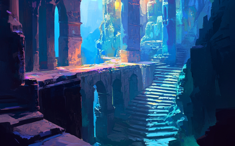
The interaction of light and shadow in game illustrations
Proper use of light and shadow in game illustrations can not only improve visual perception, but also add depth and dimension to the image. Shadows can serve to create an atmosphere of mystery, danger or drama. For example, bright light sources can highlight important objects or characters, while dark areas can hide details, creating the effect of mystery. Good interaction of light and shadow allows key elements to stand out, creating focus on the desired objects.
Light also helps reveal textures and details, making the game more realistic. In games with night or dungeon elements, it is important to use contrasting light sources to enhance the feeling of darkness and despair. In such cases, light becomes not only a tool for visualization, but also for creating an emotional background that enhances the perception of what is happening. It is important that designers carefully consider not only the main light source, but also additional effects such as reflections, refractions and blur.
Technical aspects of working with color and light in graphics software
Modern graphics programs provide ample opportunities for working with color and light, allowing designers to work out each element in detail. An important tool is color models, such as RGB for screen images and CMYK for print. It is important to set the color palette correctly so that your images look correct on different devices, be it computers, consoles or mobile platforms. This is done using screen calibration and proper color management.
In addition, to create complex light and shadow effects, designers use various technologies, such as global illumination, which simulates the behavior of light in a three-dimensional environment. This allows for more realistic scene lighting. Rendering programs such as Blender or Unreal Engine allow you to adjust light sources, reflections, and even refractions, which helps achieve the desired atmosphere in the game. It’s also important to consider performance, as overly complex lighting effects can negatively impact FPS and overall game performance.
Tips for Improving Visual Atmosphere Through Colors and Light
The visual atmosphere of a game directly depends on how the designers use colors and light. They are important tools that can influence the player’s perception of what is happening and create the right mood. In order to achieve a bright and expressive atmosphere, it is important to consider several key aspects when working with colors and light.
- Use contrasting colors to accentuate the look. Contrast helps highlight key elements on screen, making them more noticeable and important to the player.
- Choose palettes depending on the genre. Bright and vibrant colors create a fun and dynamic atmosphere in arcade games, while cool and dark colors are better suited for horror games.
- Light and shadows help add depth. The use of light and shadows can add dimension to scenes, create drama, or even a sense of anxiety and tension.
- Maintain a balance between brightness and dark areas. Images that are too bright can be boring, and images that are too dark can result in a loss of detail. It is important to maintain a balance for a comfortable perception.
- Don’t forget about cultural associations. Some colors may be perceived differently in different cultures, so you need to consider the cultural background of your target audience when choosing a palette.
As a result, the harmonious use of color and light helps create visually appealing and emotionally rich game worlds. Knowing these principles can significantly improve the perception of the game and increase its atmosphere.
Questions and answers
Answer 1: Fantasy games often use green and gold to convey a magical atmosphere.
Answer 2: Color can evoke different emotions in the player, for example, red is associated with danger, and blue is associated with calm.
Answer 3: The choice of palette depends on the genre of the game, for example, bright colors are chosen for arcade games, and more restrained colors are chosen for strategy games.
Answer 4: Light and shadow help create atmosphere by highlighting important objects and creating the effect of depth and dimension.
Answer 5: To work with color and light, various color models and technologies are used, such as global illumination in rendering.